BOKU Specialty Coffee
Boku Specialty Coffee was launched in 2025 as a specialty coffee brand built around energy, personality, and human connection. Conceived as more than a café, Boku is a social anchor — a place where people meet, pause, and form bonds. At its core, the brand celebrates community, using coffee as a shared language that brings individuals together into a collective experience.
Objectives
The goal of the visual identity was to:
Communicate the vitality and dynamism of a modern specialty coffee brand.
Express warmth, openness, and a sense of belonging.
Build a strong, recognizable personality in a competitive landscape.
Create a flexible visual system that supports both brand expression and community interaction.
Position Boku as a gathering point — not just a product, but a place where connections are formed.
IN A NUTSHELL
Strategy
Visual Identity
Identity system design
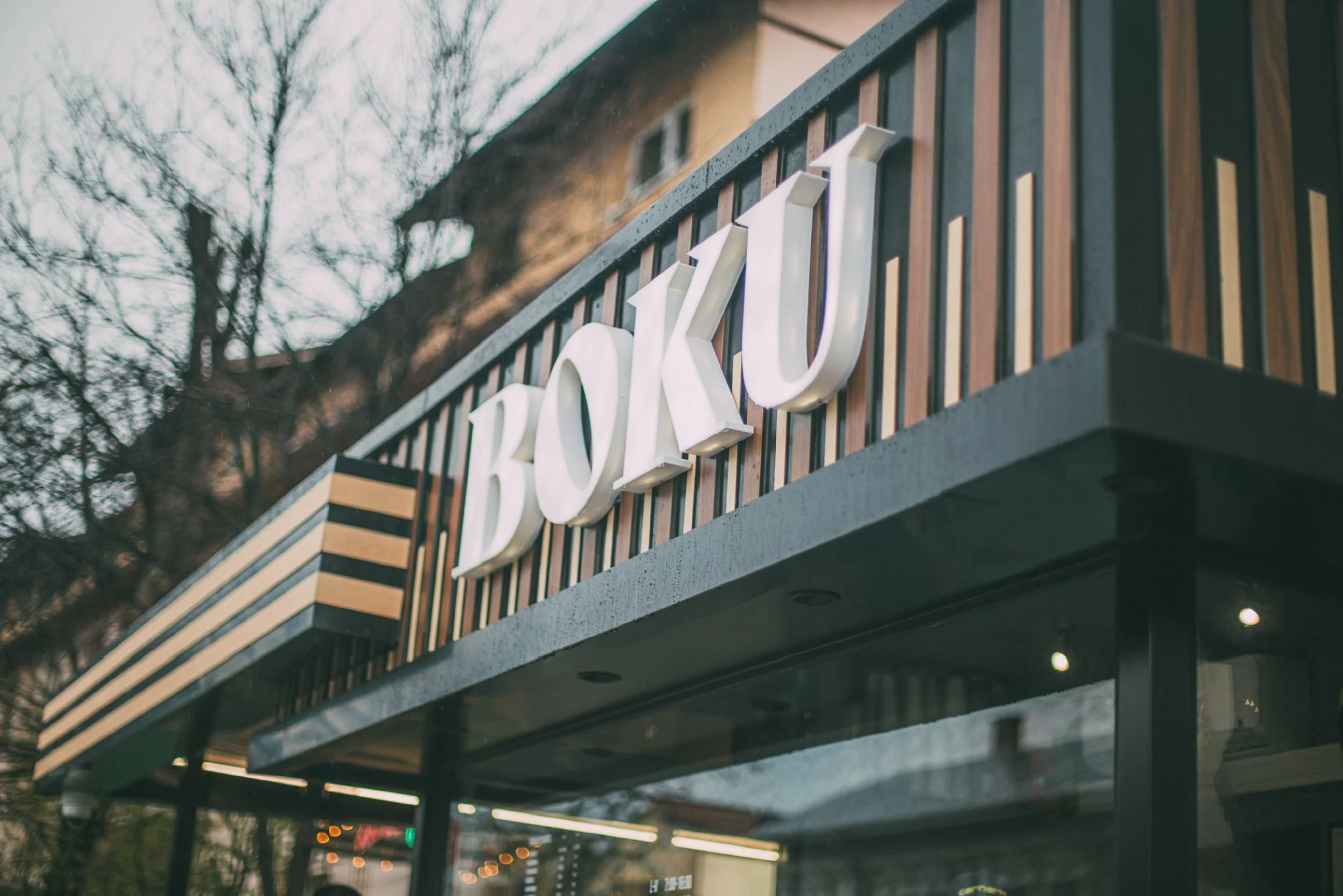
Signage
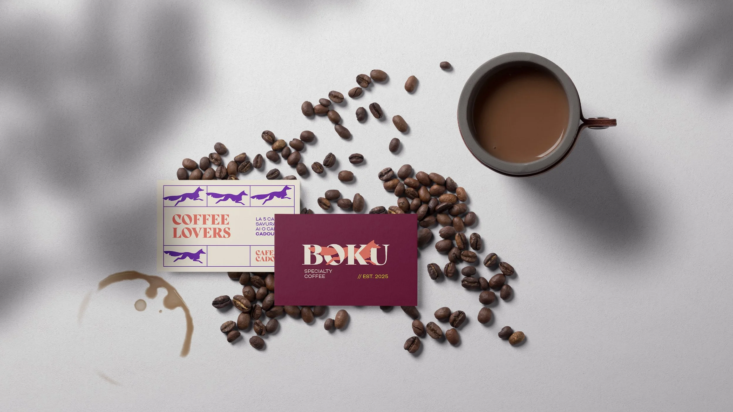
Stationery Designs
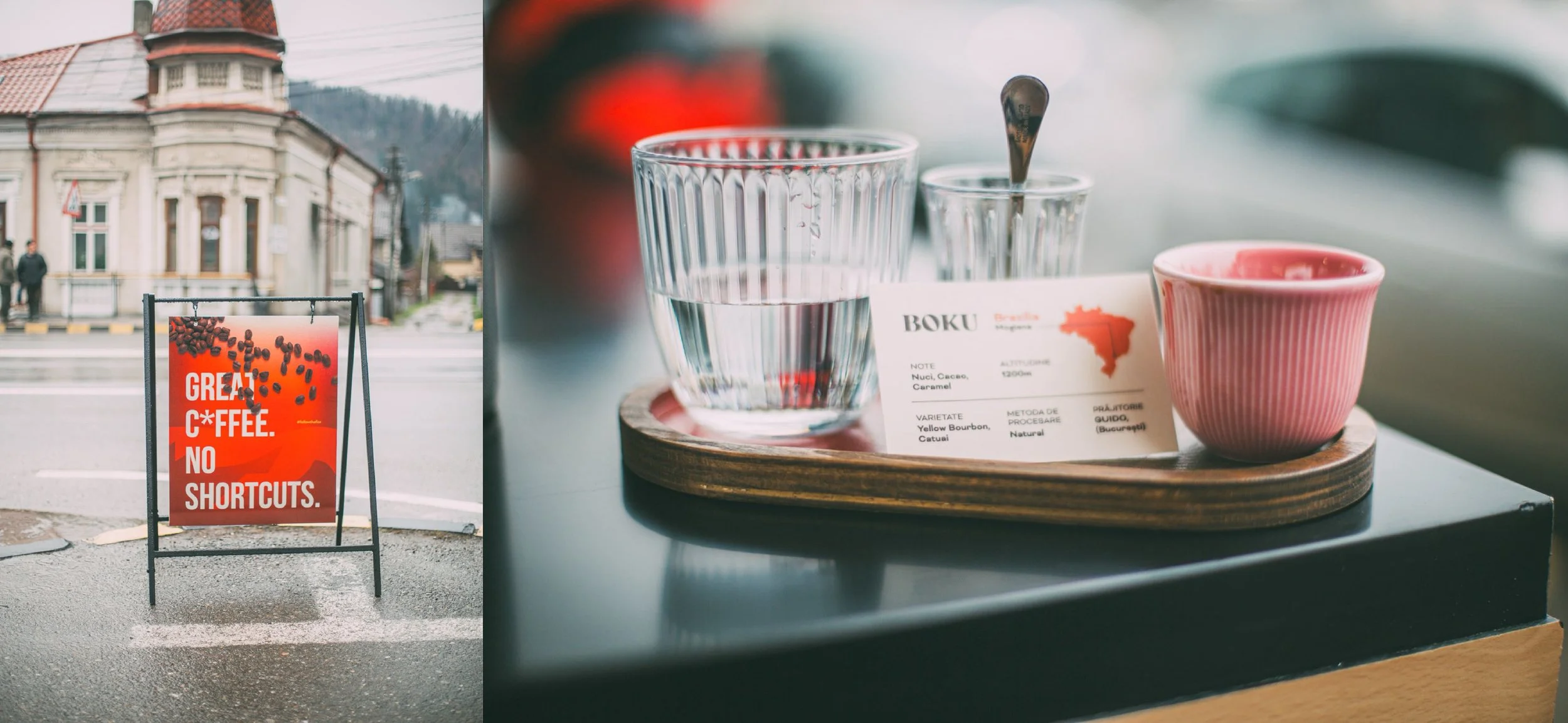
Packaging
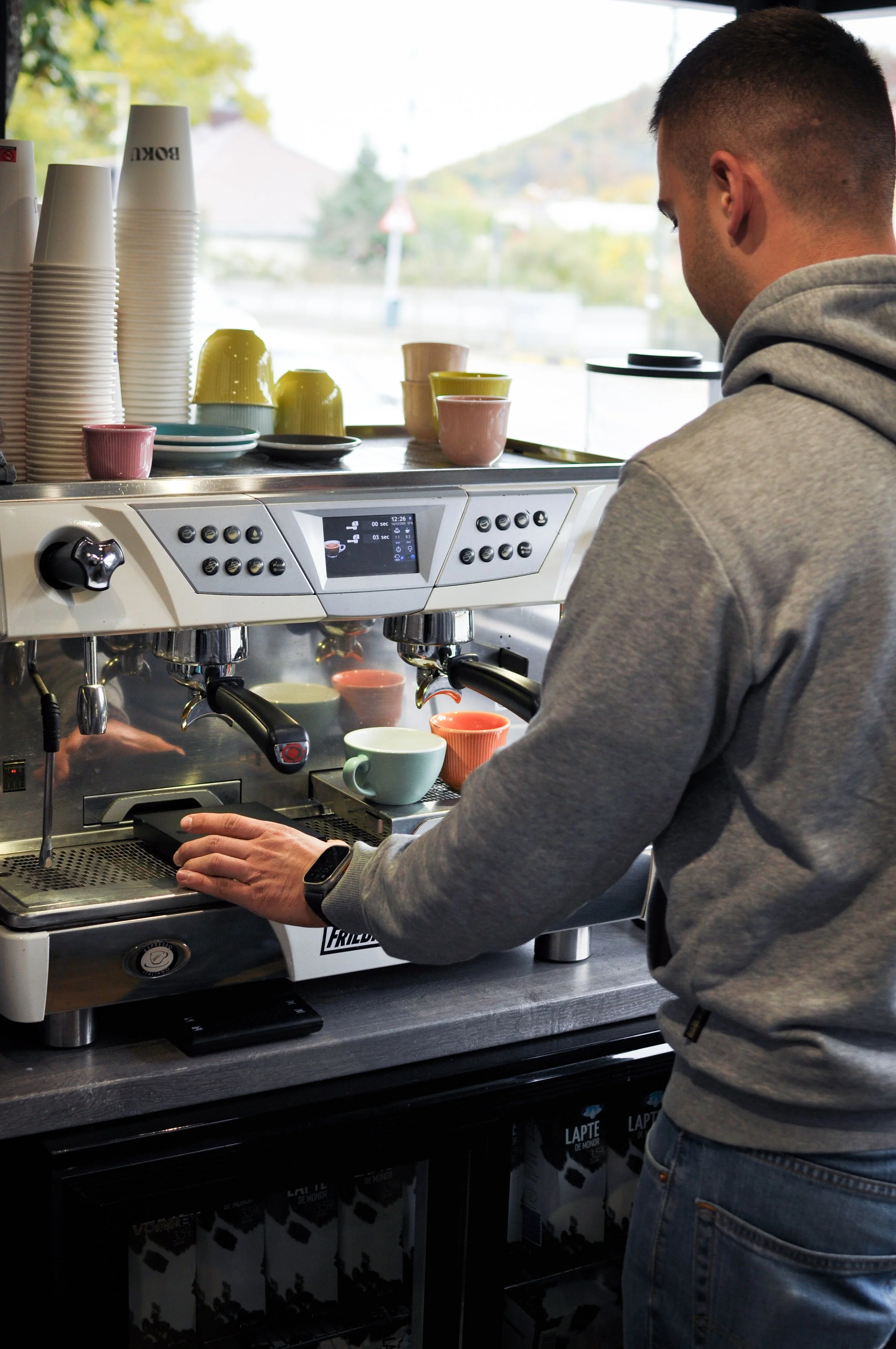
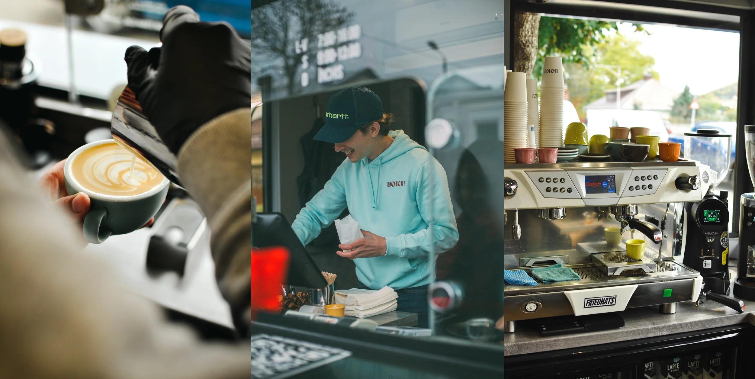
Photographs/Reels
-
2025
Story
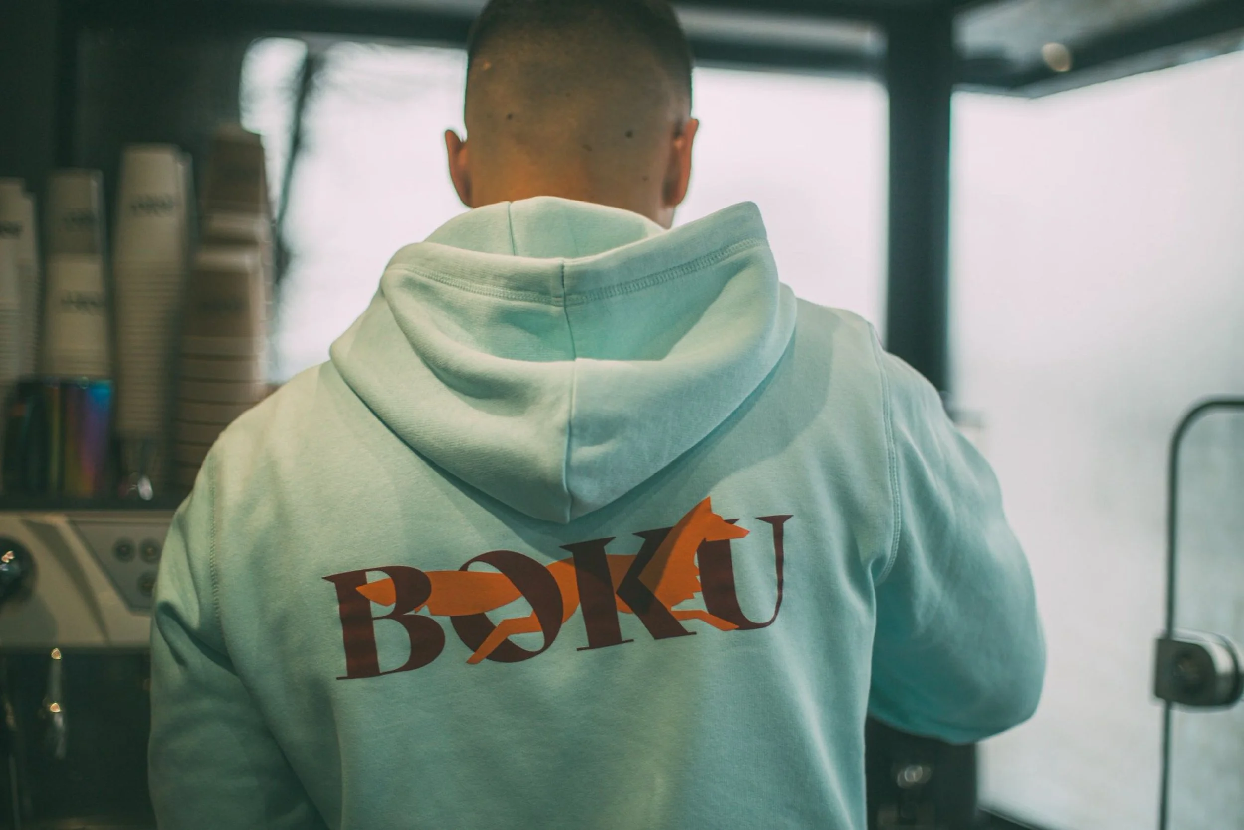
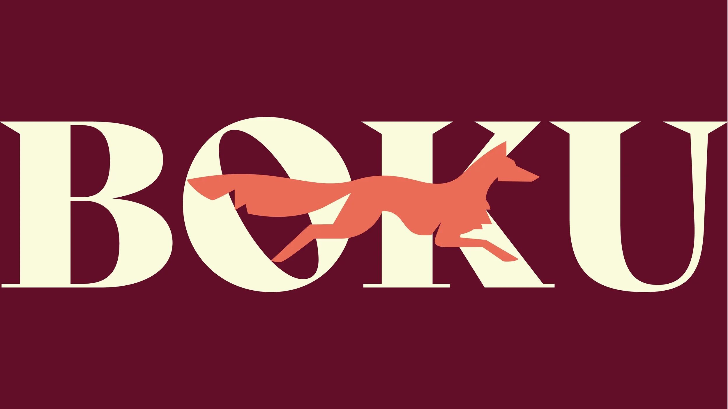
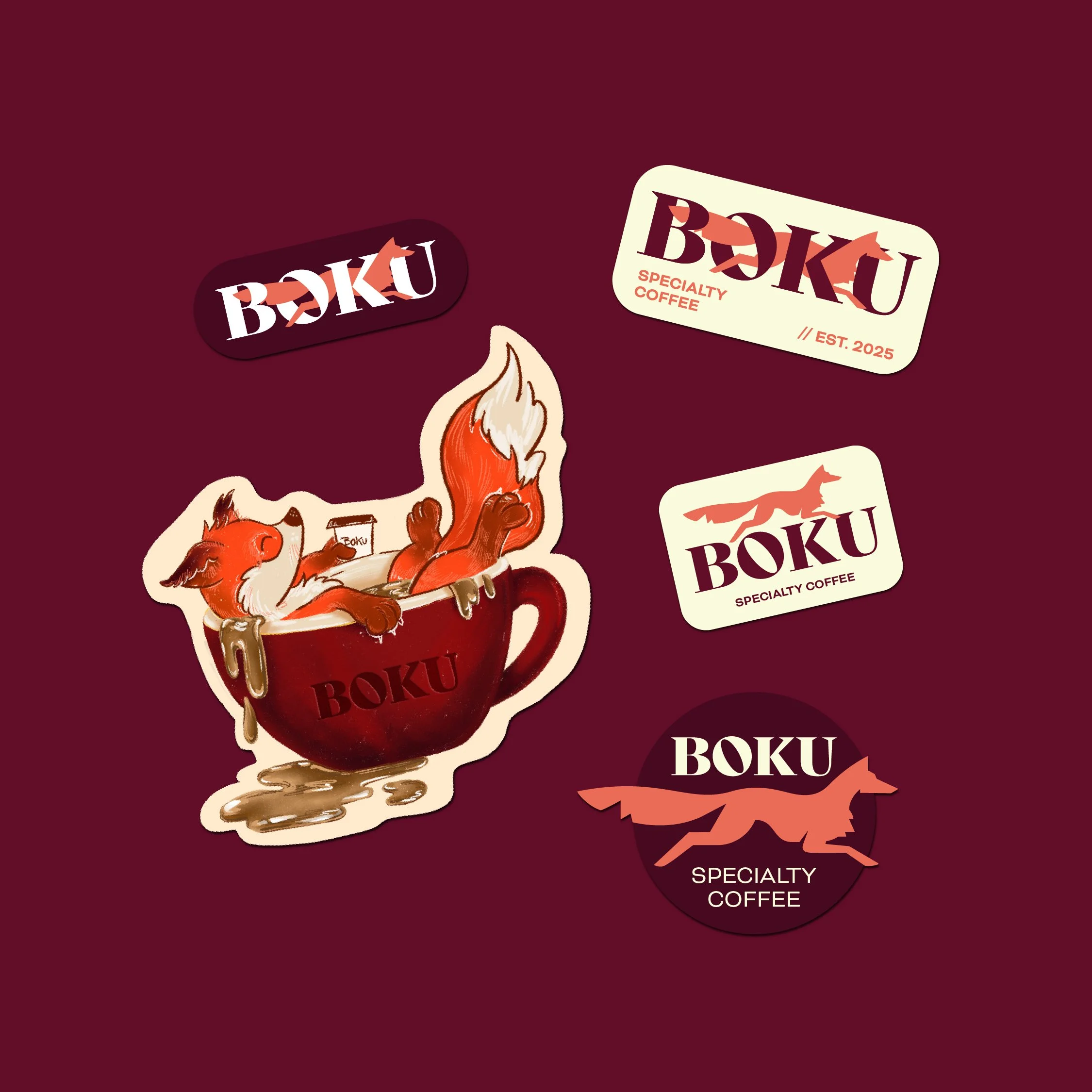
The creative direction is built around the fox, a symbol of intelligence, adaptability, and lively energy. The fox represents the spirit of Boku: curious, agile, and socially aware. It moves easily between worlds, much like the people who gather at Boku, individuals brought together by shared moments and rituals.
This concept introduces a dynamic contrast between the refined craft of specialty coffee and a playful, expressive attitude. Color, vitality, and personality are central to the identity, reflecting the diversity of the community that forms around the café. The fox acts as a unifying symbol, a visual signature that people can recognize, relate to, and feel part of. Typography and graphic elements are designed to feel confident yet welcoming, supporting both clarity and expression.
Execution
The concept was translated into a cohesive visual system applied across:
Logo and core identity – the fox symbol as a recognizable emblem of the Boku community.
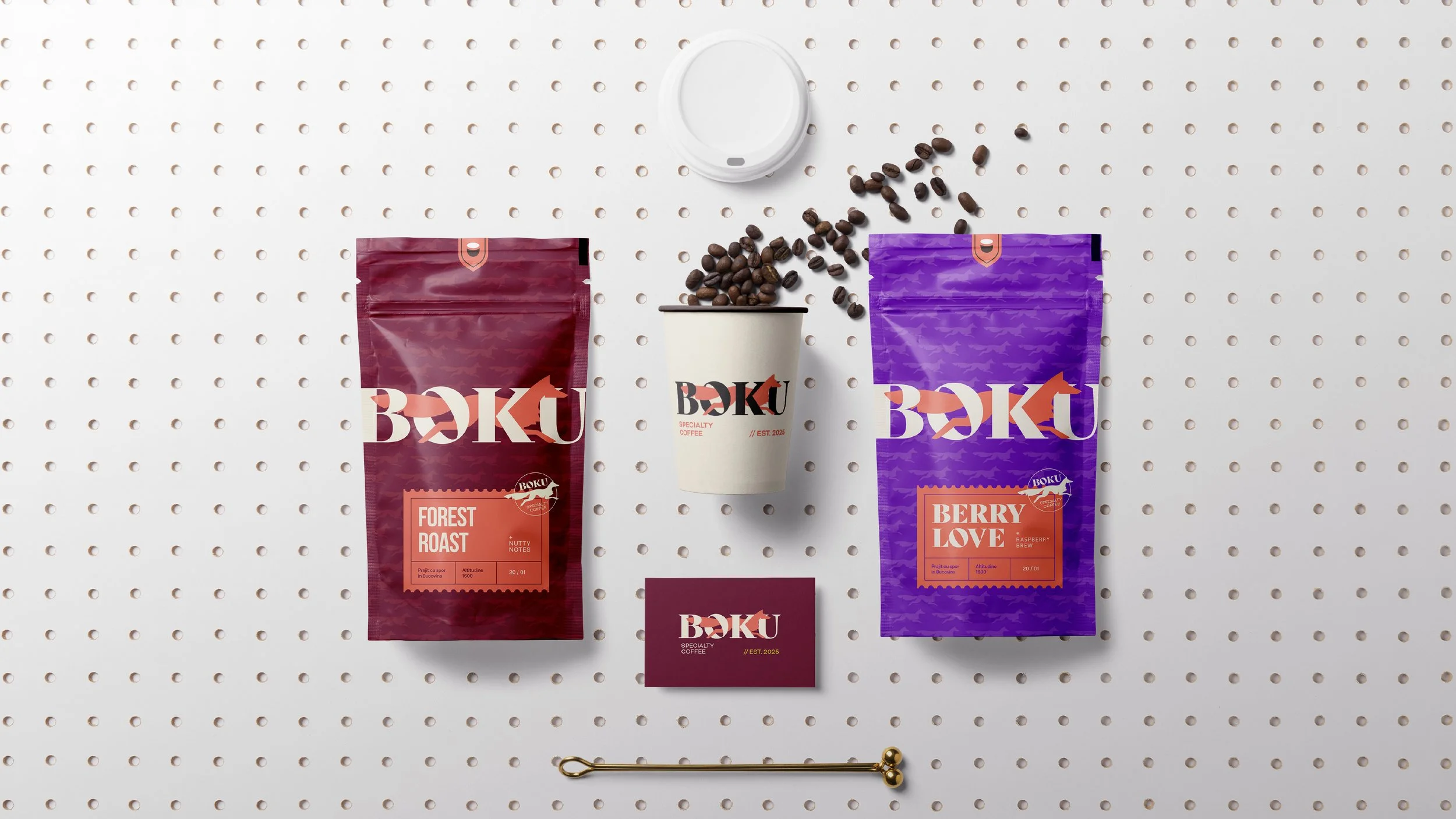
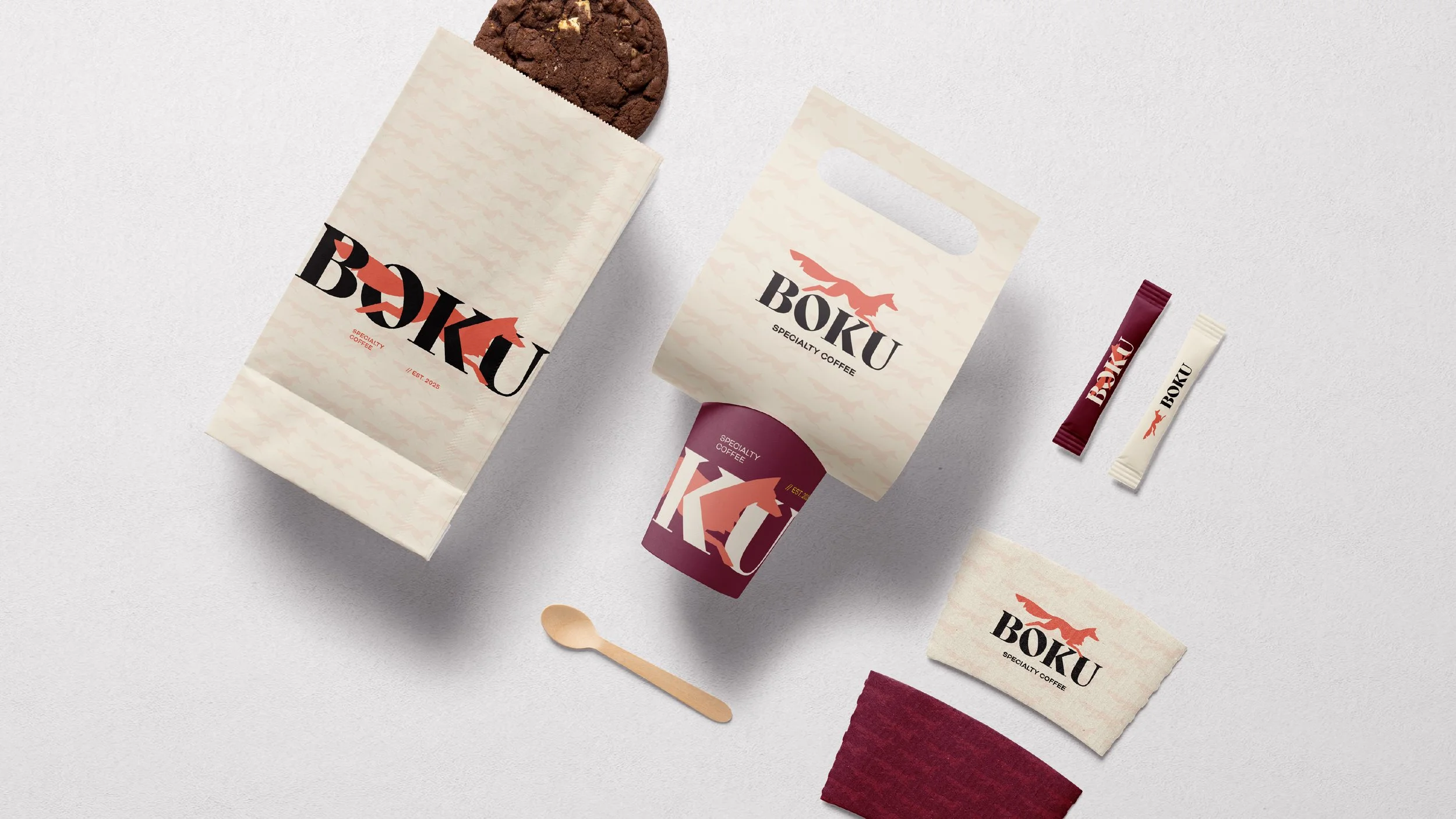
Packaging – coffee bags and labels that highlight energy and individuality, while remaining part of a larger visual family.
Communication materials – digital, print, and social media assets designed to encourage interaction and shared experiences.
The identity system is intentionally flexible, allowing variation while preserving a strong sense of unity — mirroring the way a community grows through diversity while staying connected.
Outcome
The result is a bold yet human visual identity that positions Boku Specialty Coffee as a living, social brand. The fox gives Boku a distinct character, while the expressive visual language creates memorability and emotional resonance. Most importantly, the identity supports Boku’s role as a place of belonging — where people don’t just drink coffee, but return, recognize each other, and feel part of something familiar.
More than specialty coffee, Boku is where people gather, stories unfold, and a community takes shape, with coffee as the quiet bond that turns moments into belonging.