

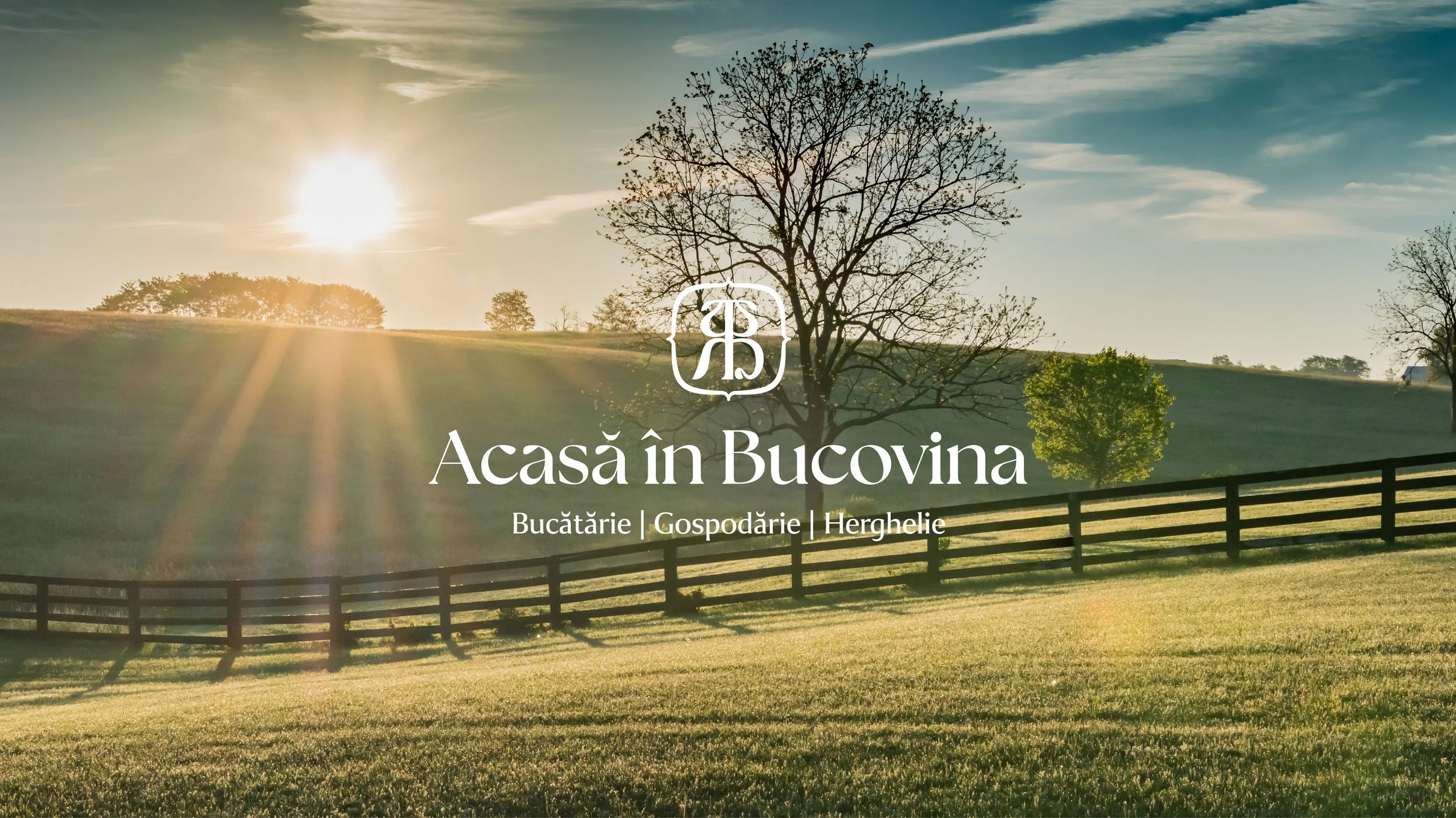
Acasă în Bucovina
Acasa în Bucovina is a farm-to-table restaurant built around honest food, traditional craftsmanship, and respect for the natural cycle of cooking — from growing and preserving to preparing and serving.
Rooted in Bucovina’s rural life, the restaurant brings together faith, family, and community through food made with care and responsibility. The challenge was to create a visual identity that reflects this way of life while clearly positioning the brand as a restaurant with deep culinary and cultural roots.
Objectives
The goal was to design a brand identity that:
Positions Acasă în Bucovina as a restaurant with culinary tradition, grounded in real farm-to-table practices.
Integrates Romanian cultural references in a contemporary and restrained way.
Creates a coherent visual language that extends naturally into the physical space, including the newly dedicated events hall.
Communicates trust, continuity, and authenticity across all brand touchpoints.
IN A NUTSHELL
Brand Strategy
Visual Identity
Identity system design
Signage
Stationery Designs
Packaging
-
2024-2025
Story
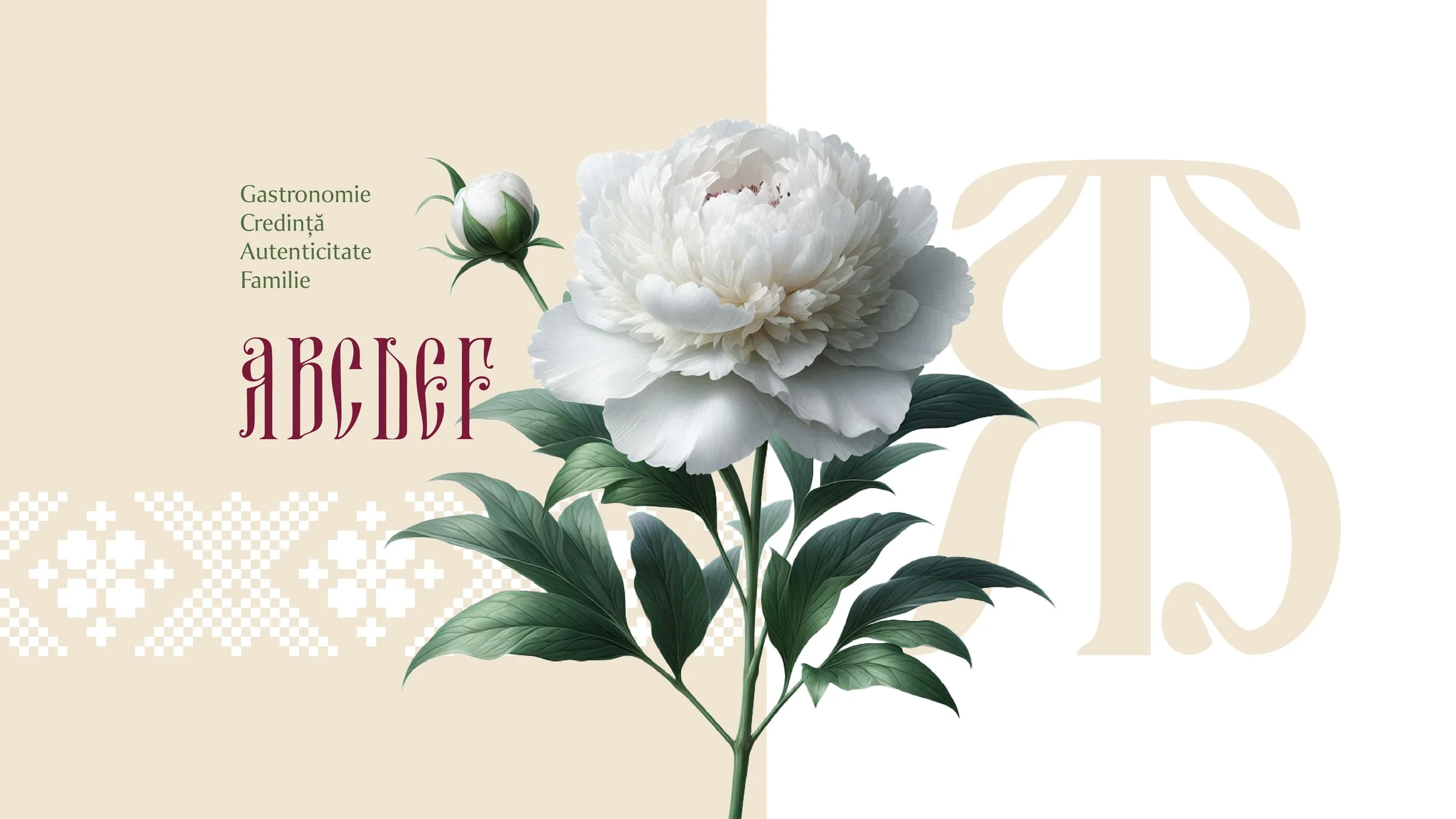
The creative direction was built around the idea of tradition as structure, not decoration.
Romanian folk embroidery became a key source of inspiration — particularly the geometric motifs and brâuri (traditional belts), symbols of continuity, protection, and belonging. These elements were abstracted into clean, repetitive geometric forms that function as a visual rhythm throughout the identity.
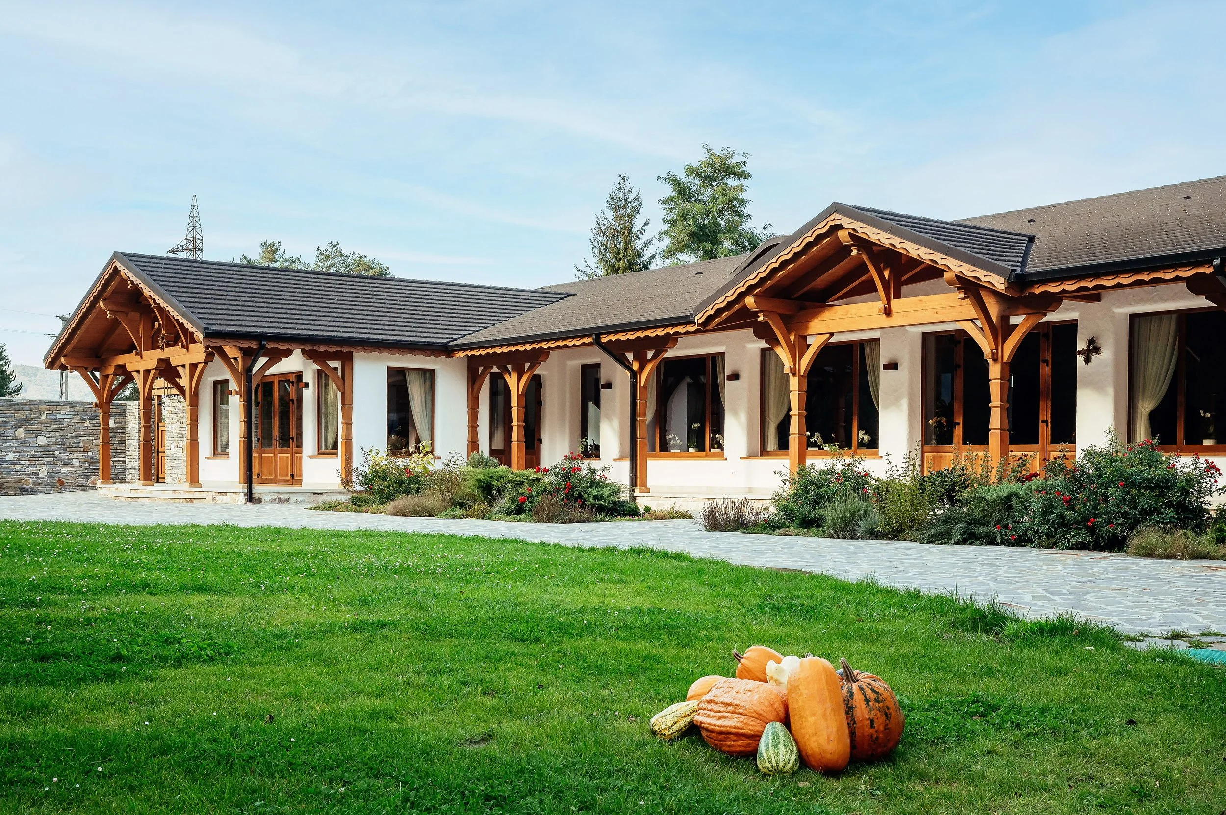
Rather than being confined to graphic materials, these patterns were designed to extend into the interior space, creating a direct visual connection between the brand identity and the restaurant’s new events hall. In this way, the visual language becomes part of the experience, not just the communication.
At the core of the identity sits the A–B monogram, inspired by old Romanian typography and early Cyrillic letterforms. The enclosing contour completes the mark and gives it the appearance of a blazon, evoking heritage, stability, and culinary tradition. The monogram acts as a seal of authenticity — a quiet statement that this is a place where food is made with history, care, and responsibility.

Execution
The visual identity was translated into a coherent and functional system:
Logo & monogram – the A–B mark, inspired by historical Romanian letterforms, enclosed in a blazon-like contour that suggests tradition and trust.
Graphic patterns – geometric brâuri derived from Romanian embroidery, used as borders, dividers, and background elements across menus and printed materials.
Color palette – warm, earthy tones that complement natural materials and reinforce the connection to land and ingredients.
Typography – a balanced mix of contemporary readability and subtle historical reference, supporting both modern use and traditional character.
Spatial integration – the same graphic language was extended into the newly dedicated events hall, ensuring visual continuity between brand, space, and experience.
The system was designed to be flexible and durable, supporting everyday restaurant operations as well as special events and gatherings.

Outcome
The resulting identity positions Acasa în Bucovina as a restaurant with a clear sense of heritage and purpose.
By blending traditional Romanian embroidery, geometric brâuri, and typographic references to historical letterforms, the brand achieves a visual language that feels rooted, honest, and timeless. Strategically, the identity reinforces the idea of bucătărie cu tradiție, creating trust and emotional connection while remaining adaptable to future growth and new experiences.

Acasă în Bucovina is about things made with purpose, from the earth, from hands and from memory. A place where food, tradition, and design meet naturally.
*We’ll complete the project with more cool stuff!
photo credit: George Boicu, Vlad Ilas - img. 4/5